From Canva to Code: Designing Smarter in the Next Era
29 July 2026
The design world is caught in a strange tension. On one side, tools like Canva have democratized visual creation, letting anyone with a browser produce a passable social media graphic in minutes. On the other side, the most impactful digital products are built with code, not drag-and-drop. The gap between these two worlds is not just about skill level. It is about how we think about design itself.
For years, the conversation has been binary: either you are a "no-code" designer using templates, or you are a developer writing CSS and JavaScript. That framing is outdated. The next era of design is not about choosing between Canva and code. It is about understanding when and why to use each, and more importantly, how to combine them to create smarter, more adaptive systems.
This article is for designers who feel limited by templates, developers who want to think more like designers, and product leaders who need to bridge both worlds. We will look at the real trade-offs, common mistakes, and practical strategies for designing smarter in a world where the line between visual tools and code is blurring faster than most people realize.
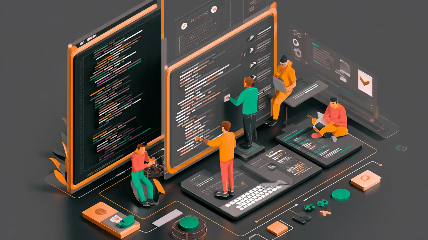
The False Dichotomy: Visual vs. Code
The most persistent misconception is that visual design tools and code-based design are in competition. They are not. They serve different purposes at different stages of a project.Canva and similar tools excel at rapid iteration for static assets. If you need a banner, a presentation deck, or a social media post, Canva is often the fastest path from idea to output. It abstracts away the technical overhead of layout, typography, and color management. That is its strength.
Code, on the other hand, excels at dynamic, interactive, and responsive design. A website or application is not a static image. It changes based on screen size, user input, data, and state. Code allows you to define rules and relationships, not just fixed positions.
The mistake is treating one as a replacement for the other. A common scenario: a team uses Canva to design a full website mockup, then hands it to developers who must reverse-engineer every pixel position into CSS. This creates friction, rework, and a loss of fidelity. The design looks great in the static mockup but breaks in the browser because the developer cannot know the designer's intent for responsiveness.
A smarter approach is to use visual tools for exploration and code for implementation, but with a feedback loop between them. Design in Canva to test visual concepts quickly. Then move to code to prototype interactions and responsive behavior. The best teams treat the visual tool as a sketchpad, not a blueprint.

When Canva Wins (and When It Loses)
Canva is not a toy. It is a legitimate tool for specific use cases. But its limitations become painful when you push beyond its intended scope.Where Canva Excels
Speed for one-off visuals. If you need a quick graphic for a blog post or a social media campaign, Canva's template library and drag-and-drop interface are hard to beat. You can go from blank canvas to finished asset in under ten minutes.Non-technical team members. Marketing, sales, and operations teams can create their own visuals without waiting for a designer. This reduces bottlenecks and empowers people to move fast.
Brand consistency at scale. Canva's brand kits allow organizations to enforce color palettes, fonts, and logos across hundreds of assets. For companies with distributed teams, this is a practical solution.
Where Canva Fails
Responsive design. Canva is built for fixed dimensions. You design for a specific canvas size. There is no concept of breakpoints, fluid grids, or adaptive layouts. What looks good on a 1920x1080 canvas will look wrong on a mobile screen.Interactivity. You cannot prototype hover states, animations, transitions, or user flows. Canva is a static tool. If your design depends on user interaction, you are guessing at best.
Data-driven design. If your layout needs to change based on real data (like a dashboard or a product listing), Canva cannot help. You would need to manually update every element every time the data changes.
Version control and collaboration at scale. Canva's collaboration features work well for small teams. But when multiple designers work on the same project, tracking changes and managing versions becomes messy. There is no Git-like history.
The practical takeaway: use Canva for assets that will not change frequently and do not need to respond to user behavior. For anything that lives on a screen and expects user interaction, code is the better path.

The Rise of Design Systems: Bridging Visual and Code
The most significant shift in the last decade is the adoption of design systems. A design system is a set of reusable components, guidelines, and patterns that bridge the gap between visual design and code. It is not just a style guide. It is a living, shared language.Design systems solve the problem of inconsistency. When a designer creates a button in Canva, it has specific dimensions, colors, and padding. When a developer codes that button, they need to know those exact values. Without a design system, the developer guesses, or the designer creates a spec sheet that quickly becomes outdated.
A design system codifies these decisions. It defines the button's properties in a centralized place, often using tokens. For example, a color token like "primary-action" maps to a specific hex value in the design tool and a CSS variable in the code. When the brand color changes, you update the token once, and both the design files and the code update automatically.
How to Build a Practical Design System
Many teams make the mistake of over-engineering a design system. They try to define every possible component before they have built anything. This leads to a system that is too abstract to be useful.Start small. Identify the most common UI elements you use: buttons, inputs, cards, navigation bars. Define their visual properties in a shared document. Use a tool like Figma or Sketch for the design side, and a CSS framework like Tailwind or a custom component library for the code side.
The key is to keep the design tokens in sync. Tools like Style Dictionary can convert design tokens from a JSON file into platform-specific formats (CSS, SCSS, iOS, Android). This eliminates manual translation.
A real example: a SaaS company I worked with had a design system with 40 components. The design team used Figma, and the development team used React with styled-components. They stored all tokens in a single JSON file. When the marketing team needed a new landing page, the designer used the Figma component library, and the developer pulled the same tokens from the JSON file. The result was pixel-perfect alignment with zero back-and-forth.

From Static Mockups to Code Prototypes
One of the most common mistakes in design workflows is treating the mockup as the final deliverable. A static mockup is a proposal, not a specification. It cannot communicate how the design behaves when a user clicks, scrolls, or resizes the window.The solution is to prototype in code earlier in the process. This does not mean every designer needs to become a full-stack developer. But understanding the basics of HTML, CSS, and JavaScript gives you a massive advantage.
The 80/20 Rule for Designers Learning Code
You do not need to master all of web development. Focus on the 20 percent that gives you 80 percent of the value:- CSS Flexbox and Grid. These two layout systems handle 90 percent of responsive design challenges. Learn how to create fluid layouts that adapt to different screen sizes.
- CSS custom properties (variables). These allow you to define colors, spacing, and typography in one place and reuse them across components. This is the foundation of design tokens.
- Basic JavaScript for interactivity. You do not need to build a backend. But understanding how to toggle classes, handle events, and manipulate the DOM lets you prototype hover states, modals, and dropdowns.
- Component-based thinking. In React, Vue, or even plain HTML, think of the interface as a tree of reusable parts. This mental model aligns perfectly with design systems.
When you prototype in code, you discover problems early. A layout that looks perfect in a static mockup might break when the browser window is resized. An animation that feels smooth in your head might be janky in practice. Code prototypes reveal these issues before you commit to production.
The Trade-Offs of No-Code and Low-Code
The rise of no-code and low-code platforms has added another layer to the Canva-to-code spectrum. Tools like Webflow, Bubble, and Framer allow you to build functional websites and applications without writing traditional code. They sit between Canva and full code.When No-Code Works
Rapid prototyping. You can build a working prototype in hours instead of days. This is invaluable for validating ideas with users before investing in full development.Simple applications. If your app has straightforward CRUD operations (create, read, update, delete) and does not need complex custom logic, no-code can be sufficient. Many internal tools, landing pages, and MVPs are built this way.
Teams without dedicated developers. Startups and small businesses often cannot afford a full engineering team. No-code platforms let them launch products that would otherwise be impossible.
When No-Code Fails
Performance and scalability. No-code platforms generate code that is often bloated and inefficient. As your user base grows, you may hit performance ceilings that are hard to fix because you do not control the underlying code.Customization limits. Every no-code platform has a ceiling. When you need a feature that the platform does not support, you hit a wall. Workarounds are often fragile and ugly.
Vendor lock-in. Your product lives on someone else's infrastructure. If the platform changes its pricing, shuts down, or introduces breaking changes, you have limited options. Migrating away from a no-code platform can be more expensive than building from scratch.
The smart approach is to use no-code for exploration and early validation, then migrate to code as the product matures. Do not bet your entire business on a platform you cannot control.
Common Mistakes and How to Avoid Them
Mistake 1: Designing in a Vacuum
Designers who work only in visual tools often miss technical constraints. A beautiful design that requires heavy JavaScript animations might be slow on mobile devices. A layout with multiple overlapping elements might be impossible to implement in a responsive way.Fix: Involve developers early. Show them your rough concepts before you polish them. Ask: "Is this feasible? How would you approach this?" This saves hours of rework.
Mistake 2: Over-Engineering the Design System
Some teams spend months defining every possible component before they have a single product. The design system becomes a theoretical exercise instead of a practical tool.Fix: Build components as you need them. Start with the most common elements. Add new components only when you have a concrete use case. A design system should evolve with the product, not precede it.
Mistake 3: Ignoring Accessibility
Visual tools often make it easy to create low-contrast text, tiny fonts, and complex layouts that are inaccessible to users with disabilities. Code can fix this, but only if you design for it from the start.Fix: Use tools that check contrast ratios. Test your designs with screen readers. Remember that accessibility is not a feature; it is a requirement.
Mistake 4: Treating Code as the Enemy
Some designers see code as a constraint that limits their creativity. In reality, code enables new forms of creativity. Dynamic layouts, micro-interactions, and personalized content are only possible through code.Fix: Shift your mindset. Code is not a limitation; it is a material. Like a sculptor learning to work with marble, learn to work with the constraints and possibilities of the medium.
Best Practices for the Next Era
1. Design in Layers
Separate your design into three layers: content, layout, and style. Content is the text and images. Layout is the structure and hierarchy. Style is the colors, fonts, and visual details.When you design in layers, you can change one without breaking the others. This is how code works. CSS handles style, HTML handles structure, and JavaScript handles behavior. Align your design process with this reality.
2. Use Design Tokens from Day One
Even if you are not building a full design system, use tokens. Define your colors, spacing, and typography as named variables. In your visual tool, use those names. In your code, use the same names. This creates a single source of truth.3. Prototype Interactions in Code
Do not rely on animated GIFs or video recordings to communicate interactions. Build a working prototype in HTML, CSS, and JavaScript. It does not need to be production-ready. It just needs to demonstrate the behavior.4. Test on Real Devices
A design that looks perfect on a 27-inch monitor may be unusable on a phone. Test your designs on actual devices, not just browser developer tools. Pay attention to touch targets, loading times, and readability.5. Embrace Constraints
The best designs often come from working within constraints. A limited color palette forces you to be intentional. A small screen forces you to prioritize. Code has its own constraints. Learn them, and use them to your advantage.
The Future: Design as a System, Not a Canvas
The next era of design is not about creating perfect static compositions. It is about creating systems that adapt, respond, and evolve. This requires thinking in terms of rules, relationships, and states, not just pixels.Canva and similar tools will continue to improve. They will add more interactivity, better responsiveness, and deeper integration with code. But they will always be limited by the abstraction they provide. The moment you need something truly custom, you will need to write code.
The designers who thrive in this new era are not the ones who master a single tool. They are the ones who understand the principles behind the tools. They know when to use a visual tool for speed and when to use code for precision. They speak both languages, even if they are more fluent in one.
If you are a designer, start learning the basics of code. Not to become a developer, but to understand the medium you are designing for. If you are a developer, learn the principles of visual design. Not to replace designers, but to communicate more effectively with them.
The gap between Canva and code is not a problem to be solved. It is a spectrum to be navigated. The smarter you are about when and how to use each, the better your designs will be.
all images in this post were generated using AI tools
Category:
Tech For CreatorsAuthor:

Adeline Taylor
Discussion
rate this article
1 comments
Zyana Dorsey
This article captures the exciting transition from design to code. It's inspiring to see how technology is enhancing creativity and efficiency in design.
August 2, 2026 at 2:26 AM
Adeline Taylor
Thanks for your thoughts! I'm glad you found the transition inspiring. Embracing technology really does open up new creative possibilities.